
Features page 1 | Features page 2 | Opinion | Reviews | Brick By Brick | Speak To Me
Featured Images | Gilmour, Guitars & Gear | KAOS Theories | Trivia | Puzzles| Humor
All that you touch and all that you see

Lasers. Mirror balls. Inflatable animals. Evocative, surreal album covers. Evocative, surreal films. Cows and pigs and pyramids and giant metal heads.
The Floyds have always taken more care than the average rock band in deciding how to represent their music visually. Their reputation for stunning concert light shows dates back to their earliest performances in the mid-1960s. Their album covers are arguably more widely-recognized and iconic than any other band in history. In short, Pink Floyd's visual side always packs a wallop, and in this issue of Spare Bricks, we take a look (pun intended) at the visual elements that make up such an important part of the Pink Floyd experience.
Creating a cover image for an issue that deals with such an impressive body of images is no easy task, though. Our cover designer, Sean Zloch, wanted to create a surreal image, a la Hipgnosis. Something catchy and clever, but visually appealing as well.
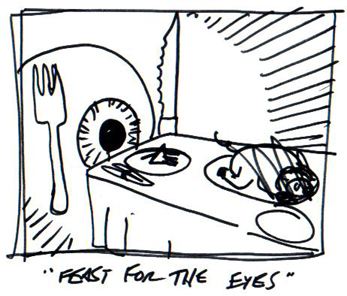 |
His first idea was an eye sitting at a dinner table with Floydian images on the table: a feast for the eyes. But he thought his sketch came off looking more silly than surreal.
Sean writes, "The pig is scratched out because pig can be served for dinner. That seemed too literal to me. That's why the smaller plate directly in front of the eye has the prism on it. I wanted something more abstract. Although I like the pun (a feast for the eyes), I didn't think the image cut it."
Then he got to thinking about seeing the Floyd in 1994, and remembering being overwhelmed by all of the visuals--the films, the lasers, the pigs. He wanted to show how overwhelming Pink Floyd is visually, and thus he started over and came up with the idea of an eye drowning in a sea of Floydian imagery.
"I'm not sure where the idea of drowning came from, but I sketched some waves with a floating eye and settled on that as the image. It had that surreal, Rene Magritte quality that is reminiscent of Storm's work and I thought it fit the issue's theme better," says Sean.
Photographer Rupert Truman, who works closely with Storm Thorgerson, reminisces about his experiences in creating Floyd album covers in this exclusive interview.
Elliot Tayman describes his earliest experiences at several classic Floyd concerts.
Bob Cooney chooses his Top Ten Floydian visuals.
Philippe van Roy and Gerhard den Hollander review the classic 1972 performance at the Hollywood Bowl.